How to Choose Stock Photos That Match Your Brand
Every time a therapist or coach asks me about website photos, I give the same answer: hire a brand photographer. The content on your website represents the quality of your business, and your photos should reflect the quality of the services you provide. Blurry images, mismatched headshots, and generic stock photos can quietly undermine your brand’s professionalism - even if everything else looks great.
But here’s the situation many people find themselves in: you’ve hired a photographer, you have a handful of beautiful headshots, but now you need to fill the rest of your website with images that don’t look completely out of place. That’s where stock photography comes in.
The challenge isn’t finding stock photos. It’s finding stock photos that look like they belong alongside your real brand photos. In this post, I’ll walk you through exactly how to do that, step by step.

Step 1: Analyze your existing photos
Before you open a single stock photo site, spend some time really looking at the photos your photographer gave you. Open them all at once and zoom out so you can see them as a collection rather than as individual images. This bird’s-eye view reveals the visual patterns running through your photos as a whole.
Don’t focus on what’s happening in each photo right now. Instead, look for:
Color: what hues keep showing up?
Tone & Temperature: are the colors generally warm or cool? Muted or vibrant?
Texture: are there prominent textures? Such as soft velvet or smooth marble?
Lighting: natural light? Soft and diffused? Harsh shadows?
For example, let’s look at my brand photos:
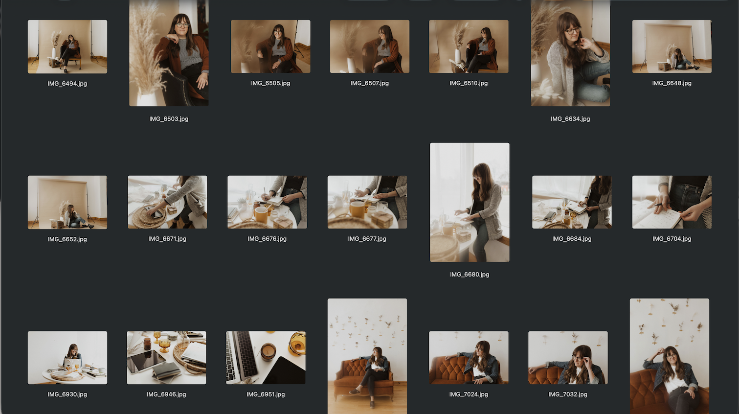
My photos contain a lot of off-white and cream, beige and rust, rich wood tones, natural woven textures, and amber accents - all shot in soft natural light with no harsh shadows. That’s my visual fingerprint, and it’s what I need to match when searching for stock photos.
Lighting is especially important and easy to overlook. If your photographer used natural light, you’ll want to find stock photos lit the same way. Mixing natural light photos with flash-heavy or artificially lit photos makes a site feel disjointed, even when the colors seem close.
Step 2: Extract your color palette
Once you’ve done a visual analysis, take it a step further by using your photos to generate a color palette. Color palette generator tools analyze your uploaded image and extract the exact colors being used, which makes it much easier to pinpoint what you’re working with and what to search for.
Two great free options:
Upload a few of your brand photos and see what comes out. You might be surprised. A photo that feels “neutral” might actually be full of warm taupes and amber undertones. One that feels “airy” might be mostly cool grays and blues.
Which brings us to something worth understanding before you start your stock photo search…
Understanding color temperature and tone
You’ve probably heard of “warm” colors (reds, oranges, yellows) and “cool” colors (blues, purples, greens). But here’s something a lot of people don’t realize: every color has a temperature, regardless of where it falls on the spectrum.
That means there are warm blues and cool blues. Warm greens and cool greens. Warm whites and cool whites. Color temperature isn’t just about the hue - it’s a quality that runs through your entire palette.
What is color temperature?
Color temperature refers to whether a color leans warm or cool. A warm blue might carry hints of purple or green in it. A cool blue might lean more gray or icy. The difference can be subtle, but when you mix warm and cool tones across a website, the result feels “off” in a way that’s hard to name but easy to feel.
This is why two photos that are both “blue” can look completely mismatched next to each other. One might be a warm navy and the other a cool slate. Same general color family, completely different temperature.
What is color tone?
Tone is a related but different quality; it comes down to a color’s brightness and saturation.
Colors with lower saturation or brightness tend to feel “muted”, often described as understated, earthy, quiet.
Colors with high saturation feel “bright”, or vivid, bold, energetic.
The same warm green, for example, can look grounded and natural at low saturation, or loud and electric at high saturation. The hue is the same. The tone is completely different.
Why does this matter for stock photos?
Because temperature and tone are what make a set of photos feel cohesive (or not). Two photos can share the same general color family and still look mismatched if one is warm and muted while the other is cool and saturated.
When you use your color palette generator on your brand photos, pay attention to both: regardless of hue, are your colors warm or cool overall? Are they muted and earthy, or bright and vivid? Once you know the answers, you have a clear, objective filter for evaluating any stock photo you come across. Instead of asking “Does this feel right?” you can ask “Is this warm and muted like my other photos?” and get a clear yes or no.
Step 3: Search by color and tone, not just content
This is the shift that makes the biggest difference. Most people search for stock photos based on what they want the photo to show. For example, a cozy reading chair, someone journaling, a cup of tea. Content matters, but it’s color and tone that determine whether a photo will actually blend with your brand.
Some good stock photo sites to search:
Pexels: free, large library, great for browsing by mood
Unsplash: free, high-quality, strong editorial aesthetic
Creative Market: paid, often more curated and distinctive
Canva Pro: paid, convenient if you already work in Canva
iStock: paid, extensive library
Instead of searching “therapy office” or “coaching session,” try searching for the feeling and palette: “warm minimal,” “earthy neutral,” “soft natural light,” “cool muted tones.” Let your color analysis drive your search terms.
Once you find a promising photo, run it through the same color palette generator you used for your brand photos. If it’s generating colors in the same temperature and tone range as your existing photos, it’s a strong candidate. They don’t need to be an exact match - just harmonious.
Pro Tip: Browse the photographer’s full collection
When you find a stock photo that fits your brand well, don’t stop there. Click through to that photographer’s profile on Pexels or Unsplash and browse their other work.
Photographers often shoot in sets… same day, same lighting, same props, same color story. If one photo works, there’s a good chance several others in their collection will too. This is one of the most efficient ways to build a cohesive stock library quickly, rather than piecing together individual photos from dozens of different sources.
What to do when a photo almost works
Sometimes you’ll find a photo you love that’s just slightly off — the right content, the right style, but the temperature is a little off, or the lighting is cooler than your other photos. Before giving up on it, try adding a photo filter.
A few tools for this:
Canva: the Edit panel includes filters that can shift a photo’s overall feel
Adobe Lightroom: gives you precise control over temperature, tone, and saturation
VSCO: a simple app for quick adjustments
Another approach: ask your photographer if they used a preset on your photos. Many photographers apply a consistent color preset across a series. If you can get that preset, you can apply it to any stock photo, and it may help blend the photo more naturally with your brand photography.
The black-and-white option (proceed with caution)
If you’re genuinely struggling to find stock photos that match your brand palette, converting everything to black and white (custom photos and stock photos alike) removes the color-matching problem entirely.
But use this option carefully, especially for therapy and coaching websites. Black and white photography can feel cold and stark, and these websites in particular need to feel warm and approachable.
The black-and-white approach works best when the rest of your site design - background colors, button colors, text accents - is warm. The warmth of the design compensates for what the photos lose. You can also mix a few black and white photos with color photos, as long as the balance feels intentional rather than accidental.
Final notes on using stock photography
Stock photos are supporting characters, not the main event
Whatever stock photos you choose, they should play a supporting role, not a starring one. Your custom headshots and brand photos belong in the highest-visibility spots: your home page, your about page, and your services page(s). Stock photos fill in the visual gaps and add texture, but your real photos are what build trust and connection with potential clients.
Don’t rely on photos to do the storytelling
A photo of stacked stones, a burning candle, or a serene landscape might feel meaningful to you, but photos are subjective. One person sees peace and calm; another sees something else entirely. Use photos to support your message, not to carry it. Make sure your copy is doing its job. Photos are atmosphere; words are meaning.
Watch the video version of this tutorial on YouTube:
Need a little more help?
If sourcing cohesive stock photos feels like more than you want to take on alone, here are a couple of ways to make it easier:
Our Squarespace templates for therapists and coaches come pre-loaded with curated, visually cohesive stock imagery. All you need to do is swap in your headshots, and you’re most of the way there. Get started →
If you’d like us to source stock photos to match your existing brand photos personally, you can book a Design Day. We’ll put together a custom collection that blends with what you already have. Learn more at holdspacecreative.com/design-days.